
SHARE LOUNGE
Provided UX/UI design and Branding for new business.
新業態サービスのUX/UIデザインと、ブランディングを提供。
Type of work
- Creative Direction
- Brand Identiy
- UX/UI design
Client
TSUTAYA BOOKS Co., Ltd.
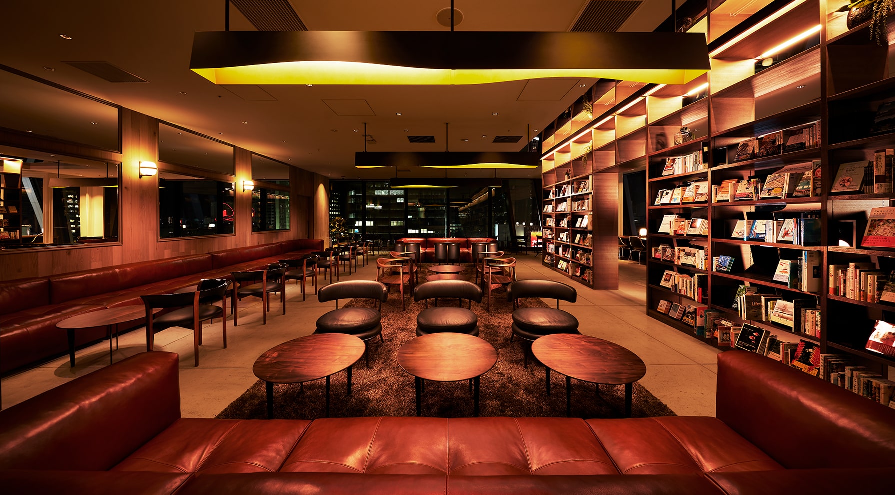
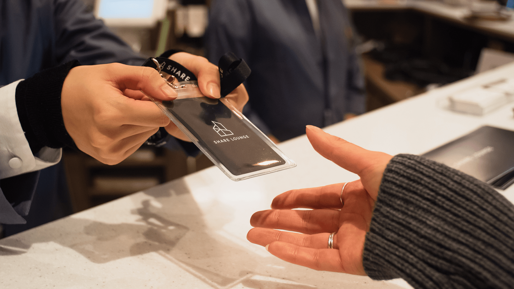
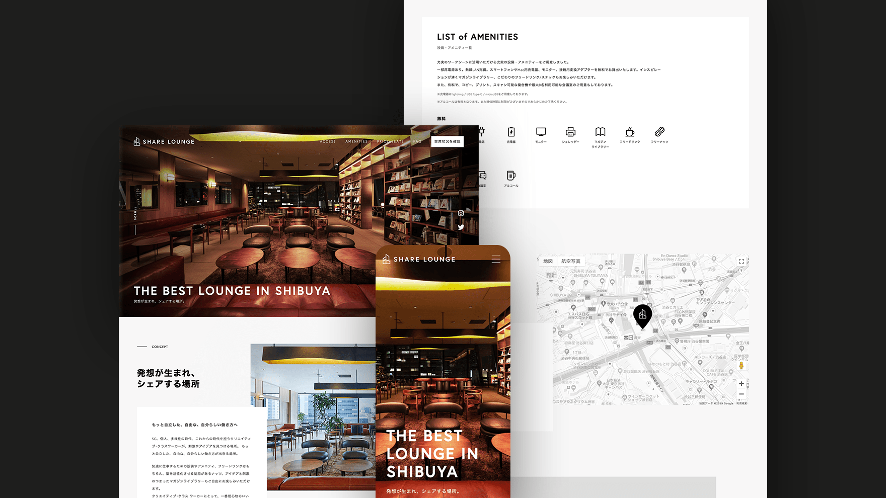
view live site >The first store of "SHARE LOUNGE," a new business model of TSUTAYA BOOKS Co., Ltd., opened in Shibuya's Scramble Square. The concept of this service is to provide the original work environment consists convenience of a "shared office" and the comfort of a "lounge" for creative workers.
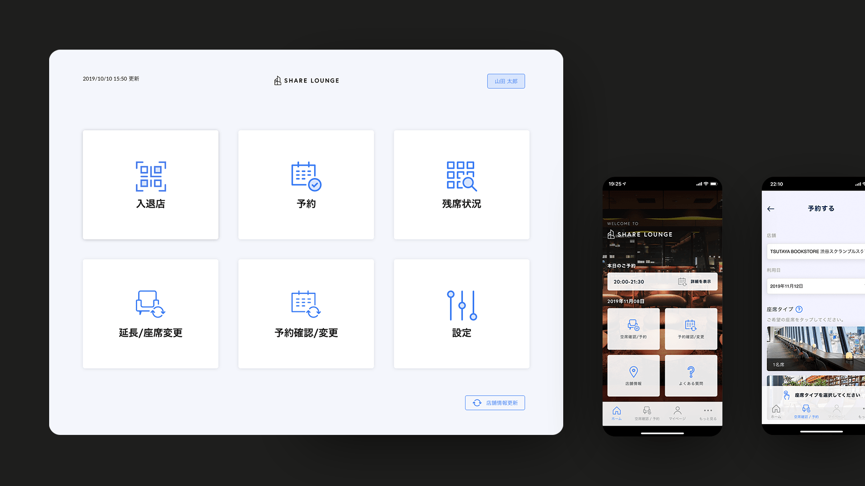
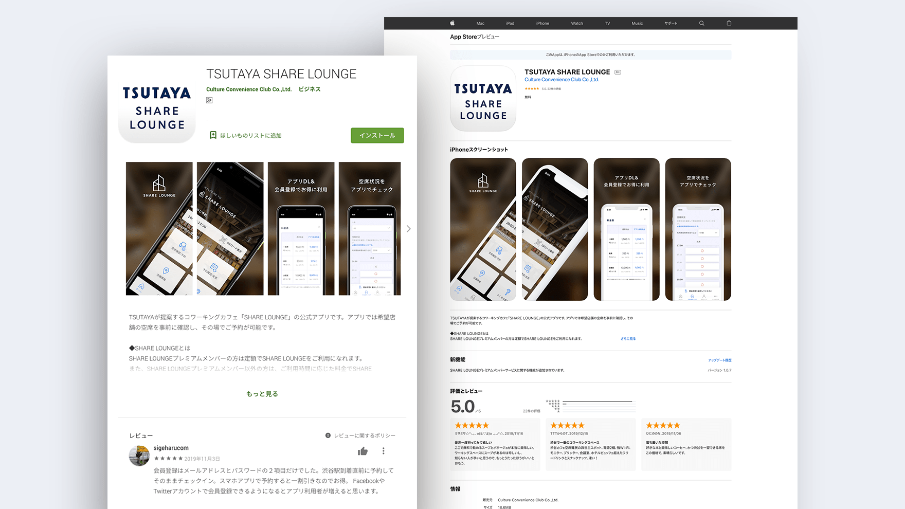
One year before the opening, we were asked to design and develop the branding for SHARE LOUNGE, a website, a smartphone app for confirming availability and reservations, and a seat management app for the store. I participated in a project with CCC FRONTIER LAB, where I was responsible for art direction, branding, and UX/UI design.
The smartphone app reached 10,000 downloads in three months after it opened. We continue working to improve the usability of the service to enhance its functionality and expand to other stores.
株式会社TSUTAYAの新業態である「SHARE LOUNGE」の一号店が渋谷のスクランブルスクエアにオープンしました。「シェアオフィス」としての利便性と「ラウンジ」の居心地の良さを持ち合わせた施設として、クリエイティブワーカーに向け、快適なワークスタイルを提供しています。
オープンの1年前より、SHARE LOUNGEのブランディング、ウェブサイト、空席確認・予約用スマートフォンアプリ、店舗用の席管理アプリのデザイン・開発までの依頼がありました。私は、CCC FRONTIER LABとプロジェクトに参加し、アートディレクション、ブランディング、UX/UIデザインを担当しました。
オープンして3ヶ月で約1万ダウンロードを獲得。現在は更なる使いやすさを求めて機能強化と他店舗展開に向けて、引き続きサービスのユーザビリティ向上を目指しています。
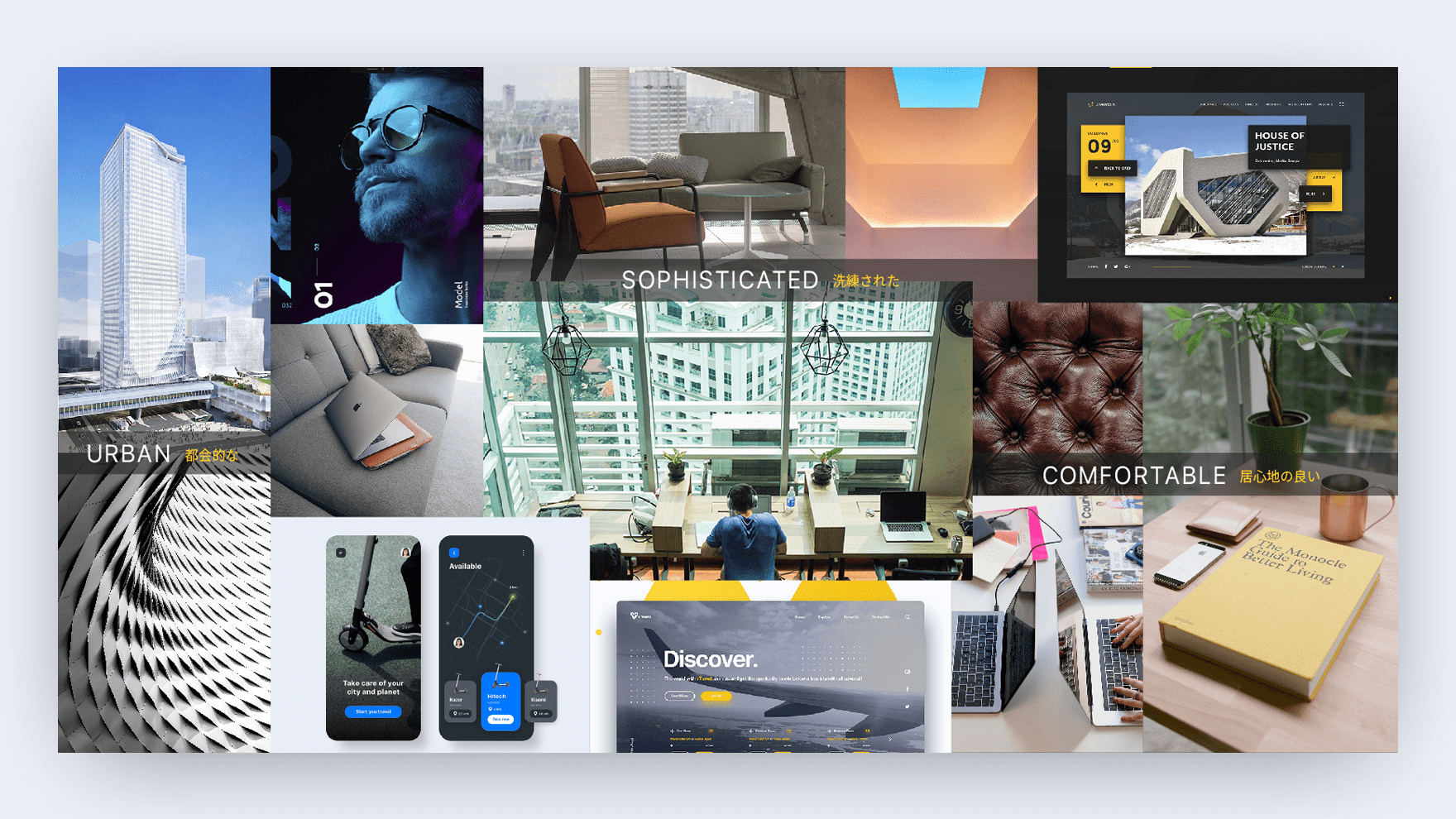
Moodboards
The process of transforming a conceptual element into a visual is vital. As we proceeded with the interviews, it became apparent that each project member had a different image of the service. To create a unified service image, we created a moodboards that reflect the results of the interviews and analysis. The moodboards helped to unify the brand image among the team and ensure smooth communication even after the transition to the design phase.
コンセプチャルな要素を、ビジュアルに変換する工程はとても重要となります。ヒアリングを進めると、サービスに抱くイメージがプロジェクトメンバーによって様々であることが分かりました。ここで統一感のあるサービスイメージの構築を目的とし、ヒアリングと分析結果を反映したムードボードとキーワードを作成しました。これによりメンバー間でのブランドイメージの統一化が図れ、デザインフェーズ移行後もスムーズな意思の疎通が図れました。
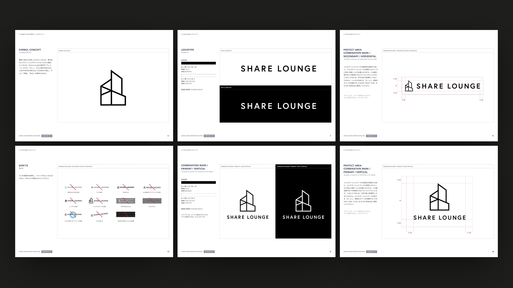
Logo Design
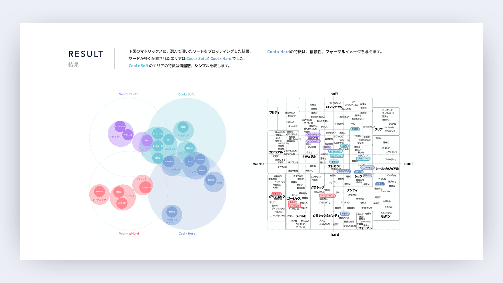
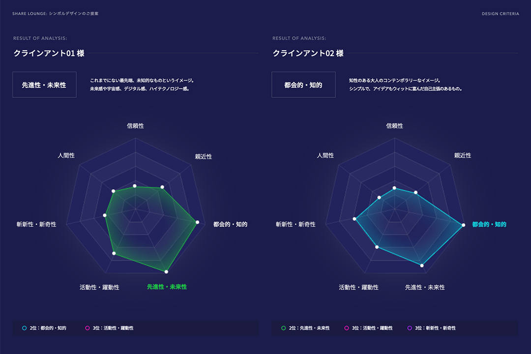
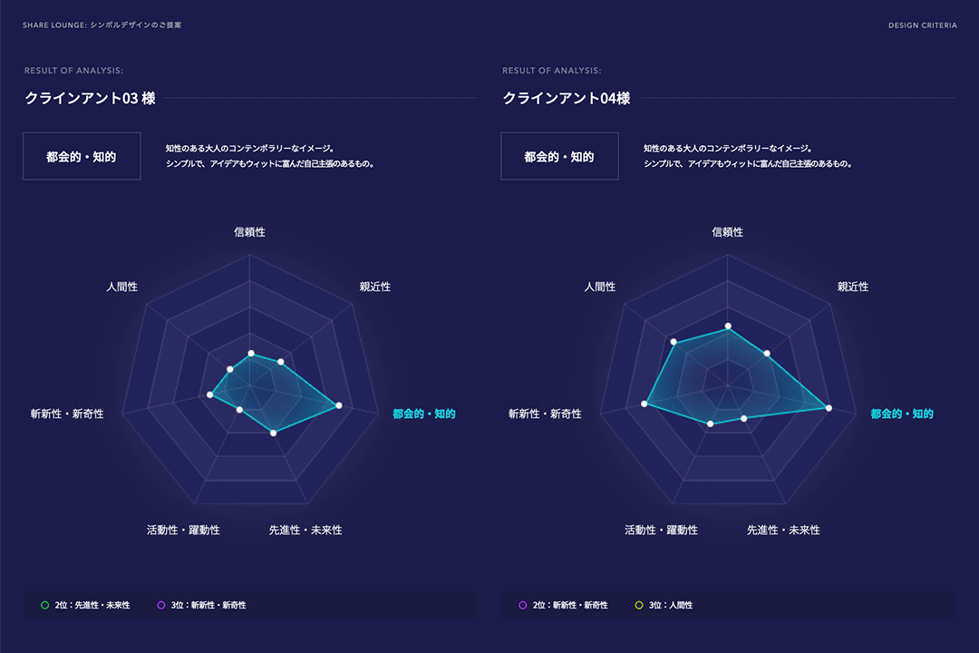
With the moodboard, we were able to unify the look and feel of the app and website. However, for the logo design, we needed further analysis. We used the design criteria method to convert the vague design direction into an apparent direction to come up with the logo's concept.
ロゴとユーザーの接点はインタフェースの枠を飛び越え、店内のカップからサイネージまで、デジタル世界から物理世界にまで広く及びます。ムードボードでは、アプリ、ウェブサイトにおけるイメージ統一は出来たのですが、新たにロゴデザインに向けて、デザインクライテリアを使用し、漠然としたイメージをさらに高解像に変換していきました。
Logo concept: A symbol of elegance and independence, neatly expressed in a modern geometric design. The symbol is based on the initial letters "S" and "L" of Share Lounge. An upward-pointing arrow appears when you change the viewpoint, which has the meanings of "development" and "independence.”
ロゴコンセプト : 優美で独立心を感じさせるシンボルを、現代的なジオメトリックデザインですっきりと表現。シンボルは、Share Loungeの頭文字「S」と「L」をモチーフとし、さらに視点を変えると、上向きの矢印が現れるような仕掛けを施し、そこに「発展」「自立」の意味も込める。
Interface Design
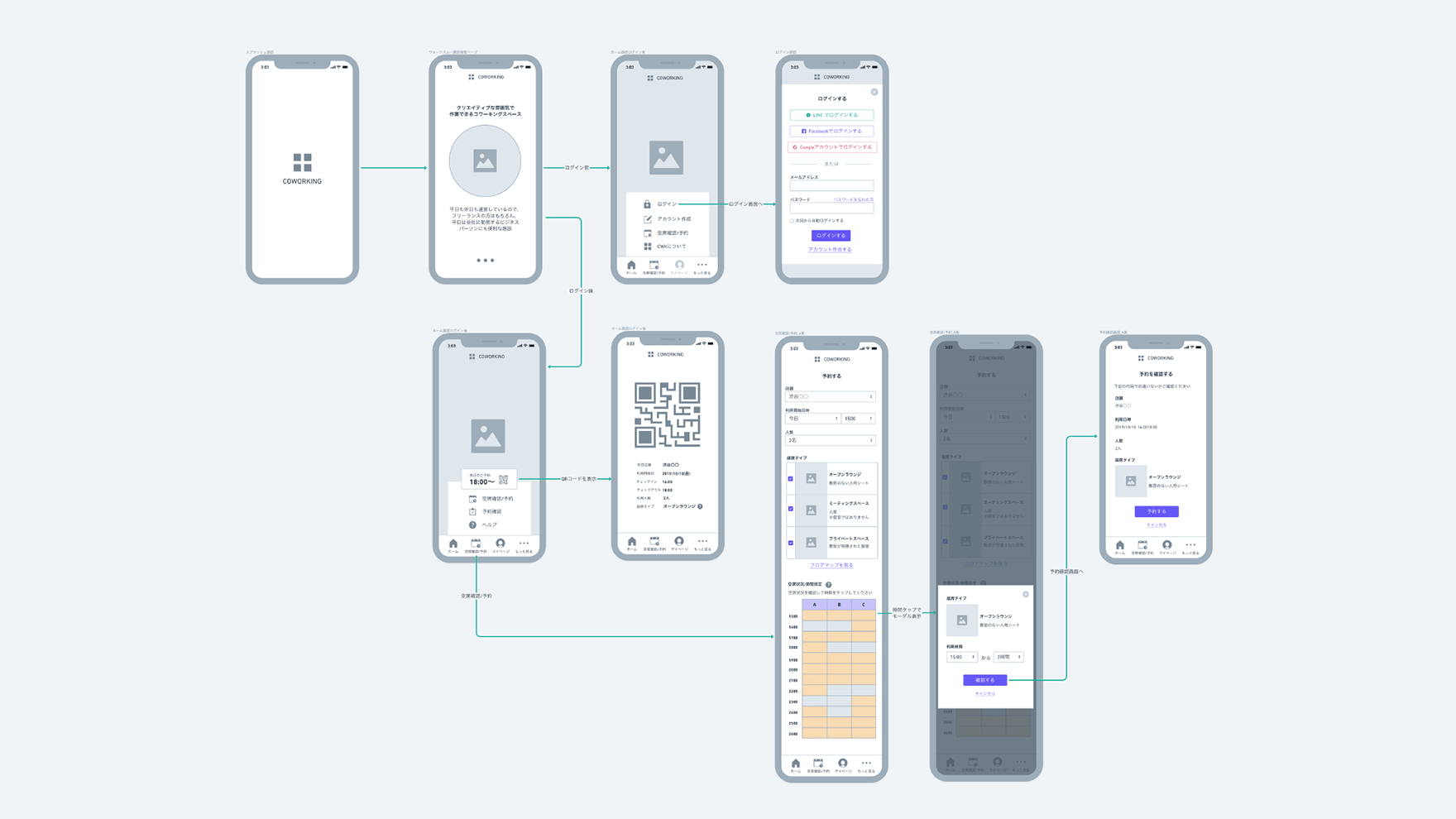
From the design stage, we repeatedly tested hypotheses in every situation and made improvements through wireframes and prototypes to create a highly usable screen design. We aimed to solve issues such as simplifying the booking process, which can be particularly complicated, and smooth check-in and check-out flow. Fonts, images, icons, and colors are selected based on the art direction embodied in the moodboards and design criteria analysis to create UI design synchronized with the service image.
設計段階から、あらゆるシチュエーションでの仮説検証を繰り返し、ワイヤフレームとプロトタイプを通じて改良を重ねユーザビリティの高い画面設計を進めることが出来ました。特に複雑になりやすい予約手順の簡略化、スムーズなチェックイン・アウトのフローなどの課題解決を目指しました。ムードボード、デザインクライテリアを通じて具体化されたアートディレクションを元にフォント、画像、アイコン、カラーを選定していき、サービイメージとシンクロするUIデザインを実現しています。
Service movie
As the Share Lounge was about to open, we were asked to create a video to explain this new service format adequately. I worked on casting, composition, filming, and editing with a specially assembled team. As a result, we were able to appeal to new customers to use this service by showing a video on a monitor near the counter, which motivated them to use it.
オープン間近になり、この新しいサービス業態を効果的に説明する施策としての動画制作の依頼がありました。キャスティング、構成、撮影、編集までを1ヶ月で特別に編成したチームと共に担当しました。結果、カウンター付近のモニターで映像を流すことにより、新規のお客様に向けて、サービスの利用イメージを訴求でき、利用動機に繋げることが出来ました。
Creative Direction: Hiroshi Sasaki (8UNITE)
UX/UI Design: Hirosh Sasaki (8UNITE), Mochizuki Rise (CCC FRONTIER LAB), Rui Kawasaki (CCC FRONTIER LAB), Haluka Shimoda (FADED)
Development: CCC FRONTIER LAB
Photography: Yuichiro Ohmura
Movie: Sam Yotusya, Rumi Ooki